A LITTLE CHANGE. A WHOLE NEW FEELING.
AI Kitchen Design
Cabinets, worktops and light — changed on a photo of your actual kitchen, not a showroom.
Your starting point
Your first 2 designs are on us · no card needed
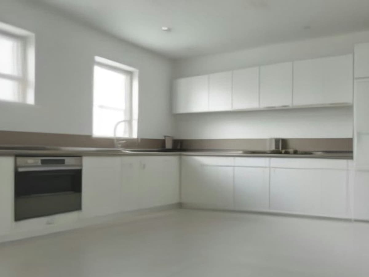
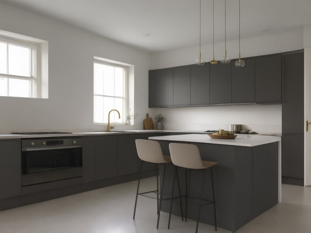 BeforeAfter
Drag the handle to compare before & after
FIND WHAT FEELS LIKE YOU
Different moods.
Same room.
Start with a feeling. Explore a few of our favourite directions, then make one your own.
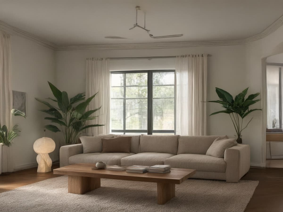 AI design example
01Modern
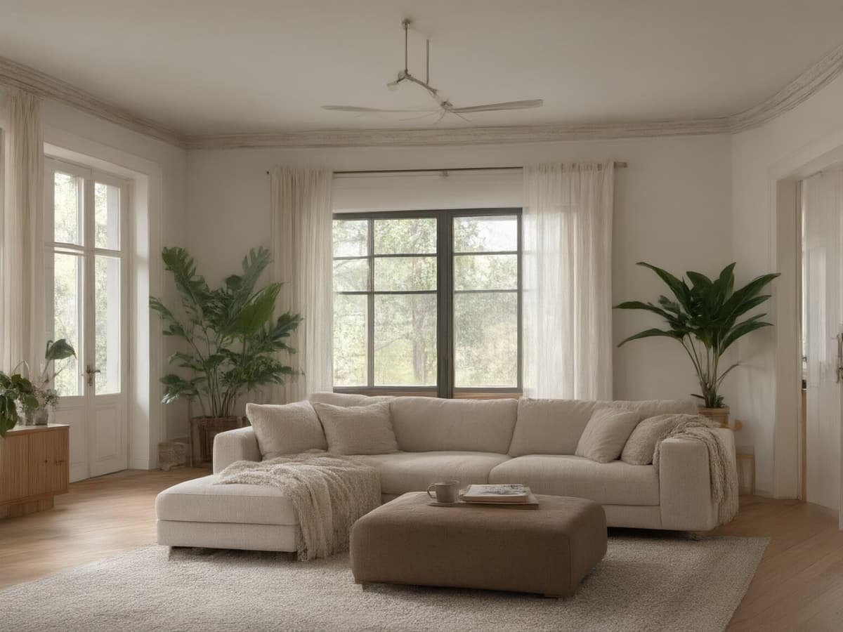 AI design example
02Scandinavian
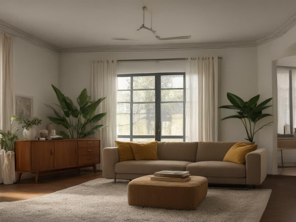 AI design example
03Mid-century
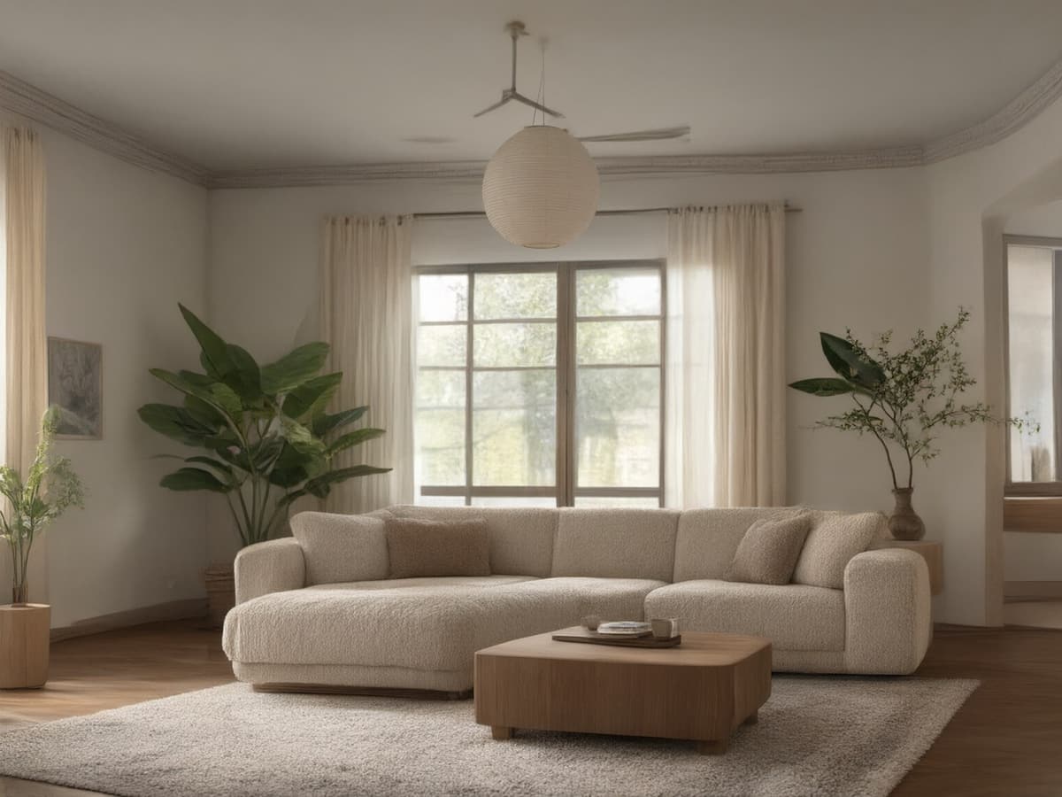 AI design example
04Japandi
ROOMFLOAT / FIELD NOTES
Cabinet & Countertop Styles
Kitchens are judged on two surfaces: the cabinet front and the worktop edge. Everything else — handles, splashback, floor — is supporting cast. That is why the kitchen prompt is written around door profiles rather than around "style", and why the useful iteration instructions are specific: "shaker doors instead of slab", "thin quartz edge, not a bullnose", "handleless with a shadow gap".
The presets map onto real specifications. Scandinavian gives you pale oak or painted flat fronts and a light worktop. Modern pushes toward handleless slab doors and a waterfall edge. Farmhouse pulls in an apron-front sink and a painted shaker profile. Industrial wants dark frames, open shelving and a darker worktop than you would normally dare.
- Slab fronts read calmer in small kitchens; shaker adds shadow lines that break up a long run.
- A worktop that matches the splashback makes a narrow kitchen feel wider.
- Two-tone (dark base, light wall cabinets) needs a strong horizontal line to work — usually the worktop.
ROOMFLOAT / FIELD NOTES
Small Kitchen Ideas
In a small kitchen the render's job is to tell you what to remove. Generate the same photo three times with progressively simpler briefs — full restyle, then "same layout, fewer objects", then "only change the cabinet colour" — and you will see how much of the cramped feeling is stuff rather than square footage.
Three moves survive almost every small-kitchen render: run the worktop and splashback in one material, take the cabinets to the ceiling so the eye stops at the ceiling line rather than at a gap, and swap upper cabinets for a single open shelf on the wall that gets the most light. If the render still looks tight after those, the problem is the layout, and no colour is going to fix it.
ROOMFLOAT / FIELD NOTES
Kitchen Before & After
A kitchen is the room where a render most often gets used as a real decision: do we reface or replace, do we keep the worktop, is the wall worth taking out. The before/after slider is how you answer that with somebody else in the room — point at the cabinet run, drag, and the argument is over in three seconds.
Use the iteration box rather than fresh generations for those decisions. "Keep everything, change only the doors to matte sage" is a real quote you can take to a joiner; a brand-new render is a new conversation.