A LITTLE CHANGE. A WHOLE NEW FEELING.
Paint Color Visualizer
Put a colour on your actual wall, in your actual light, before you spend $40 on a sample pot.
Your starting point
Your first 2 designs are on us · no card needed
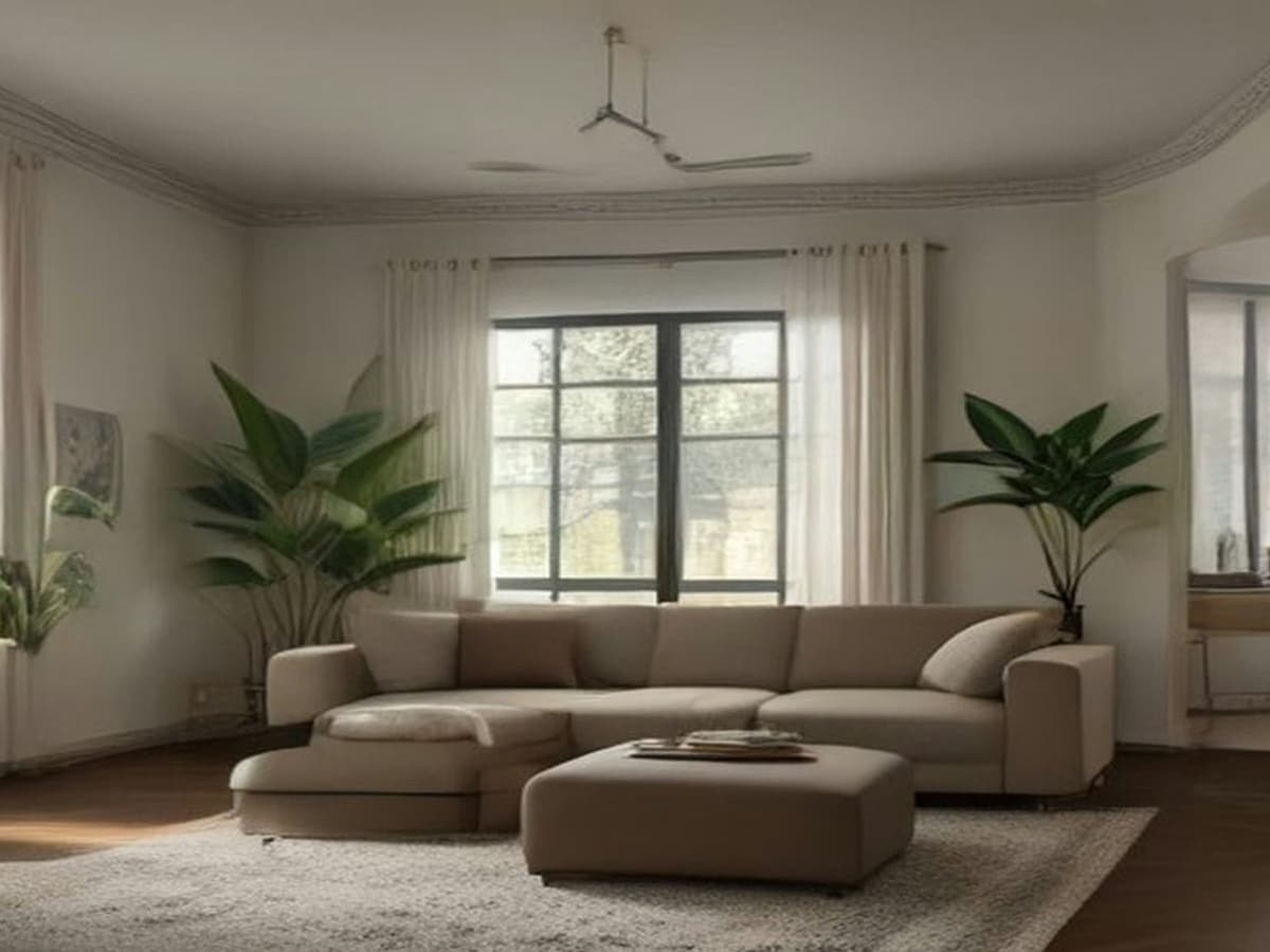
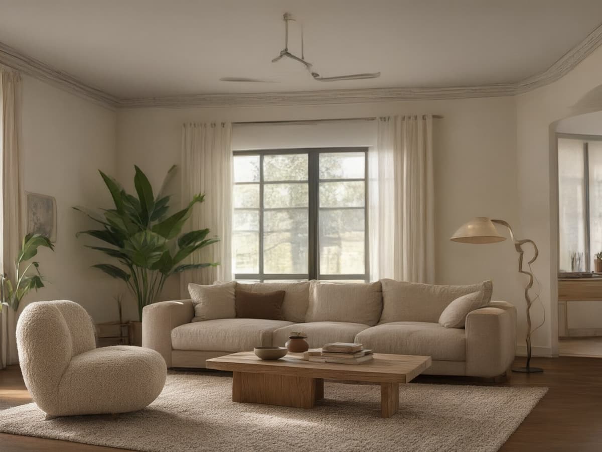 BeforeAfter
Drag the handle to compare before & after
FIND WHAT FEELS LIKE YOU
Different moods.
Same room.
Start with a feeling. Explore a few of our favourite directions, then make one your own.
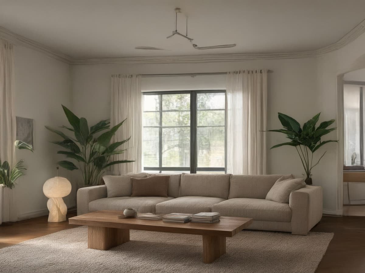 AI design example
01Modern
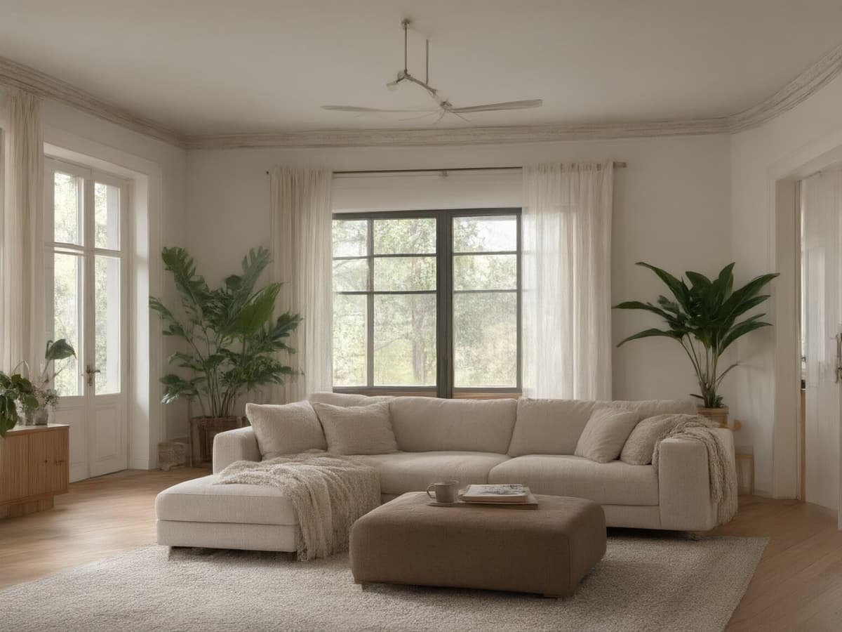 AI design example
02Scandinavian
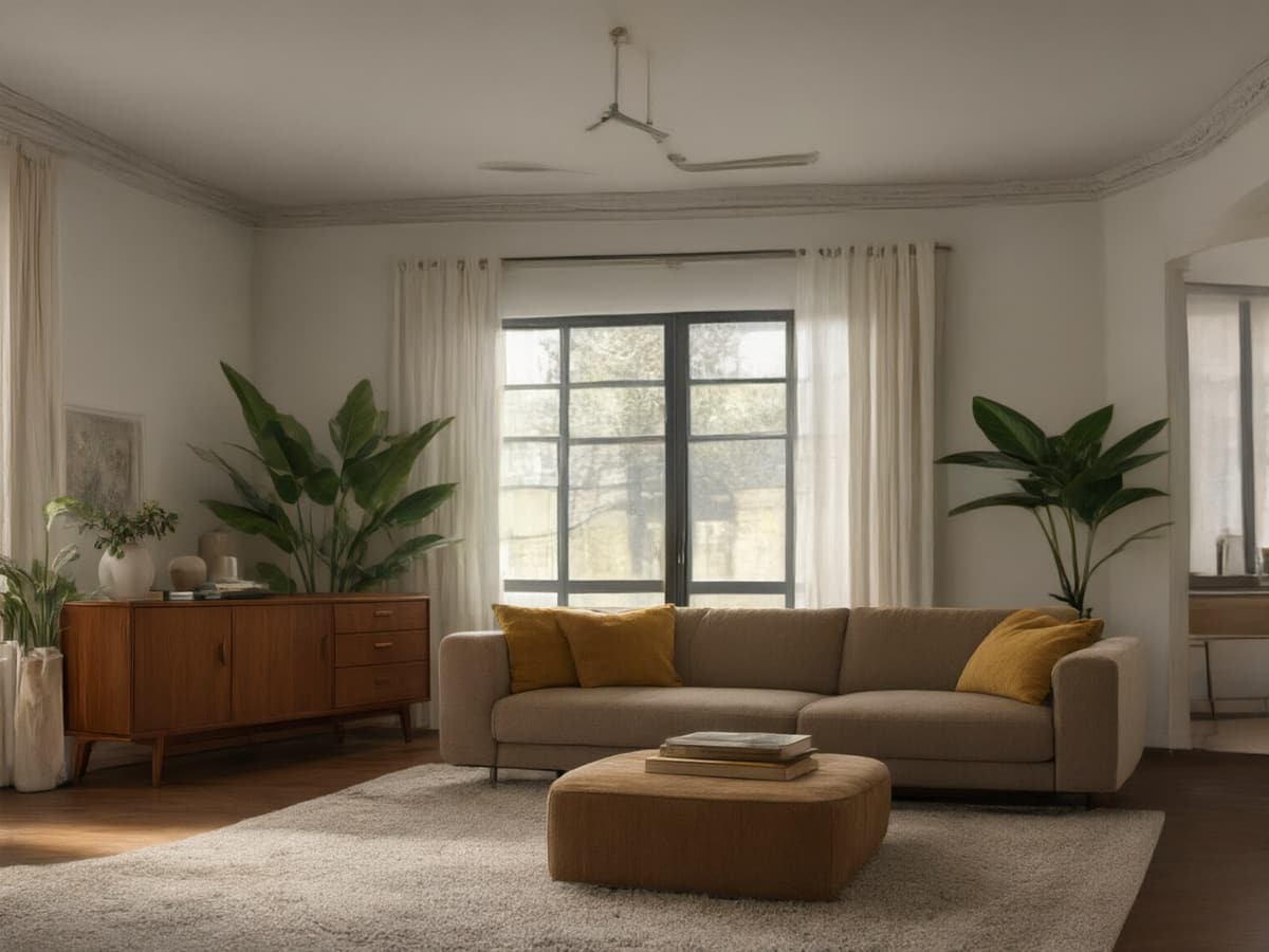 AI design example
03Mid-century
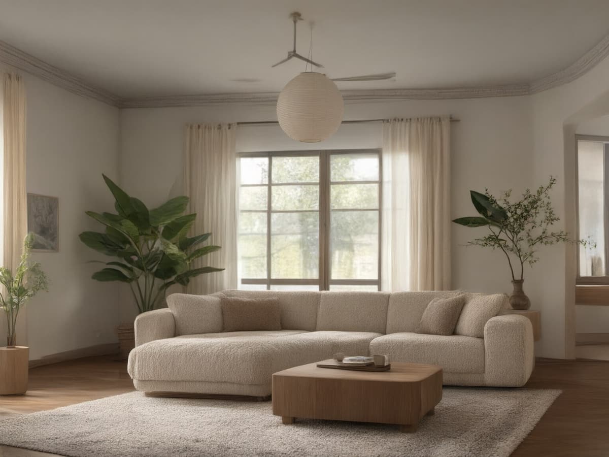 AI design example
04Japandi
ROOMFLOAT / FIELD NOTES
AI Paint Visualizer vs Color Swatches
A paint chip tells you what a colour looks like under a shop's fluorescent tubes. Your wall is lit by a north-facing window at 4pm, next to a warm oak floor and a grey sofa, and the same chip will read three shades cooler there. That gap is why people buy sample pots, paint a patch, hate it, and live with it for a year.
A visualizer closes most of that gap without the patch. Upload the photo, name the colour, and the model repaints only the wall surface — keeping the furniture, the floor, the shadows and the time of day exactly as they were. You are not looking at a colour; you are looking at that colour in that room.
- Works on walls with pictures, radiators and furniture in front of them.
- Keeps ceiling, trim and floor untouched so the comparison stays honest.
- Test two colours side by side by generating twice and swiping between results.
ROOMFLOAT / FIELD NOTES
Popular Wall Colors
The colours people actually search for cluster into four families, and each one fails in a predictable way. Warm whites go pink under tungsten light. Greiges go flat in a north-facing room. Sage reads grey once the sun goes down. Deep greens and navies look spectacular in a render and can swallow a small room with one window.
- Warm white — safe everywhere, but check it at night before committing to a whole flat.
- Greige — needs a warm floor or it reads institutional.
- Sage and olive — best in rooms with two exposures; risky in a single north window.
- Terracotta and clay — beautiful with oak, punishing next to cool grey tile.
- Deep green or navy — test the darkest corner, not the wall next to the lamp.
ROOMFLOAT / FIELD NOTES
How to Test a Color on a Real Photo
Take the photo at the time of day you actually use the room, with the lights you actually use. Stand in the doorway and shoot wide; a close-up of one wall hides the corner where the colour will look darkest. Do not use flash, and do not apply a phone filter — the model copies whatever grade you feed it.
Then run the same photo three times: the colour you think you want, one shade lighter, one shade darker. The middle option almost always wins, because paint reads darker on a large surface than on a chip. If you are painting a whole flat, repeat on the room with the worst light — the hallway, not the living room.